Achieving color consistency is key when it comes to screen printing. It ensures that your designs look sharp and professional, which is crucial for branding and customer satisfaction. In Cape Coral, where vibrant designs can often be found decorating a variety of items, keeping colors consistent is a common challenge and a top priority. Whether you're working with apparel, promotional items, or custom products, understanding how to maintain color uniformity can greatly enhance the visual appeal and effectiveness of your prints.
Cape Coral's vibrant community and sunny weather create the perfect backdrop for lively and colorful designs. With many local businesses and events relying heavily on screen printing, getting colors just right can be a game-changer. Companies often use screen printing to create a lasting impression, and color consistency plays a big role in making sure your brand leaves a memorable mark. So, let's dive into the basics of color theory and how it impacts your screen printing results in this lively city.
Understanding Color Theory
Color theory might sound complex, but it’s all about understanding the relationship between colors and how they mix. This is especially important in screen printing, where you want the final output to match your original design.
- Primary Colors: These are red, blue, and yellow. Think of them as the building blocks for all other colors.
- Secondary Colors: By mixing primary colors, you get green, orange, and purple. Each pair of primary colors produces a unique secondary color.
- Tertiary Colors: Mixing a primary color with a secondary one gives you tertiary colors, like red-orange or blue-green.
Why is this important? Well, every time you blend colors, you affect the final look of your screen print. Mixing the wrong ratios can lead to an entirely different color than intended.
Understanding how colors relate not only helps in achieving the desired shade but also aids in decision-making when selecting ink and planning color combinations. Let’s consider an example: If you're printing a design that requires different shades of blue, understanding how adding a tint of white or a shade of black can change its tone will make all the difference in achieving consistency across multiple prints.
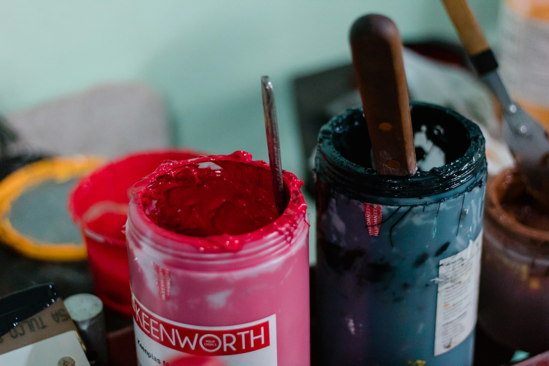
Choosing the Right Inks
Selecting the appropriate ink is another critical element for maintaining color consistency. Different types of inks can produce varying effects, and each comes with its own advantages and limitations. Here are a few popular options:
1. Plastisol Ink: This is a go-to for durability and vibrant colors. It sits on top of the fabric, which keeps colors bright through multiple washes. However, it can feel heavier on the fabric.
2. Water-Based Ink: Perfect if you’re going for a softer feel and more muted colors. It's absorbed by the fabric, which makes it great for a vintage effect, but less effective for vivid colors.
3. Discharge Ink: Ideal for dark fabrics, it replaces the existing dye with the desired print color. This method is excellent for soft finishes and bright colors on darker fabrics.
To ensure you're picking the right ink, consider the type of material you're printing on and the desired outcome. Durability, color vibrancy, and fabric feel should all factor into your ink choice. Always test your chosen inks to see how they interact with each other, as different combinations can sometimes produce unexpected results. Understanding these subtleties will keep your screen prints looking pristine and consistent, enhancing your Cape Coral designs.
Color Matching Techniques
To achieve precise color matches in screen printing, several techniques and tools are available to help maintain consistency. One of the most effective methods is using the Pantone Color Matching System (PMS). It provides a standardized approach to color matching, ensuring that your chosen colors look the same across different prints and materials. By matching your inks to PMS numbers, you can guarantee that your screen prints remain consistent and visually appealing.
In addition to PMS, digital tools and software have become invaluable for color accuracy. Advanced software allows screen printers to manipulate and adjust colors on computer screens before they are applied to the material. This digital preview helps spot and rectify potential color inconsistencies before printing, saving you time and resources. Make it a routine to check and calibrate your digital displays regularly to ensure they reflect true-to-life colors.
Practicing good color matching not only enhances the uniformity of your prints but also increases client satisfaction, as expectations align more closely with delivered products. By understanding and employing these techniques, you’re a step closer to achieving perfect color harmony in every print.
Conducting Test Prints
Test prints are like rehearsal for your final production, making them a critical part of the screen printing process. They allow you to spot errors and make adjustments before committing to a full print run. Start this process by preparing a small batch using the exact inks and materials like the main project. This practice run helps identify and fix unforeseen issues, ensuring your designs come out exactly as planned.
Here's a simple step-by-step guide to conducting test prints:
1. Prepare Your Materials: Set up your screens, inks, and fabric. Ensure everything is clean and organized.
2. Print a Sample: Use your chosen inks to print a small run on the same type of material you’ll use for the main project.
3. Review Your Results: Look at how the inks laid down, check for consistency, and compare colors to your original design.
4. Make Adjustments: If colors aren't accurate, tweak your ink mixtures, pressure settings, or print speed.
5. Repeat if Necessary: Sometimes, multiple rounds of test prints are needed to get things just right.
Conducting test prints might seem time-consuming, but rushing this stage could result in inconsistent colors in the final product. By taking this extra step, you guarantee high-quality, consistent prints that meet both your standards and client expectations.
Maintaining Equipment and Environment
Maintaining your screen printing equipment and managing your work environment are crucial factors in achieving consistent color results. Well-maintained equipment ensures that inks are applied evenly, reducing the chance of color variation. Regularly clean your screens, squeegees, and presses to prevent residue buildup, which can alter ink application.
Your printing environment also plays a role in color consistency. Factors like temperature and humidity can influence how inks dry and adhere to materials. In Cape Coral, the climate is generally warm and humid, which can affect the drying time of inks. Consider investing in climate control solutions for your workspace to stabilize these elements. By keeping the space well-ventilated and at the right temperature, you minimize the risk of unplanned color shifts.
A controlled environment and well-maintained equipment are both integral to producing top-notch screen prints. With these basics covered, you set the stage for delivering reliable, high-quality results every time.
Enhancing Color Consistency with Professional Help
In some situations, seeking professional help can be the best option to ensure color consistency in your screen printing projects. Experienced professionals have the expertise and tools to manage complex prints and guarantee consistent results. They can offer insights into ink selection, color matching, and equipment maintenance that might be challenging to master on your own.
Professional services can also ensure efficiency, saving your team the time spent on troubleshooting and adjustments. By collaborating with skilled professionals, you gain access to high-quality resources and industry-tested techniques, allowing you to focus on creativity and design.
In short, if achieving flawless color consistency feels like a daunting task, turning to experts can help bridge the gap, ensuring your prints are vibrant and meet your high standards. This approach leaves you confident that all aspects of your screen printing project are covered with expertise and precision.
To truly see the benefits of meticulous color consistency in your designs, consider how expert service can elevate your projects. If you're ready to achieve flawless screen printing in Cape Coral, explore how iCON Advertising can make your vision a reality. They bring years of expertise to ensure every print meets your highest standards. For more details, check out their offerings today.